MISSING: A brief history of the missing person poster in society, art & fiction
How the aesthetics of the missing poster channel dread into our everyday lives

Big, bold letters reading ‘MISSING’ in capital letters, accompanied with a picture of the person that is lost. The ink on the paper washy and the colours faded from exposure to the sun. When strolling through a big city it doesn’t take long to stumble upon a poster similar to the one described, stapled to a tree or taped to a pole. I always found these missing posters fascinating, merely because they channel a feeling of dread into our everyday lives. One can speculate endlessly on the fate of the person on the poster. A missing person can be a runaway, holed up somewhere. Or the person was kidnapped, murdered or commited suicide. A missing poster is a desperate attempt to find a loved one. A mixture of despair and hope is flattened and compressed into a single piece of paper and then put on display, for everyone to see. The photo at the centre a stark reminder of a happier time. The saddest thing, of course, is that many of these missing persons will never be found alive.
Controversial Dutch rapper Steen once made an art project involving the missing posters of cats and dogs. He took every one he stumbled across and presented them as a bundle at his art academy, playing with the moral implications of removing such sensitive imagery (on which telephone numbers and home addresses are often displayed) from the street while simultaneously raising questions about ethics and privacy.
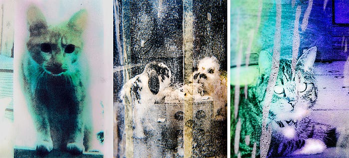
Photographer Bjorn Staps also created a photo series in which missing pet posters were the subject (see Figure 1). He shot details of the posters, highlighting the weary images, often worn down by exposure to the elements. The fact that these artists were drawn to this macabre type of imagery says something about its moral language and aesthetic appeal. It doesn’t really matter if it is a poster made in order to find a pet or a person: the layout and typography are almost always the same — predominantly functional — describing the missing one using bold, simple font and (in most cases) a single, recent image. The posters are distributed in places where the chances of a sighting are most likely. Aside from being handed around, this often means that the posters are distributed on public service boards, bus stops or on surfaces at busy streets; making them the most democratic part of an investigation, no matter the level of professionality. With the poster, people or law enforcement aim to find the one that’s missing. They shoot broad and wide, like buckshot. Aimed at the general public, hoping that one of the bullet fragments will hit a target… a person that has seen or heard something. The posters are indiscriminate and the opposite of private for they always appear in the public space and give a cognitive shock to everyone who sees them, in so reminding the general public of a (possible) disaster or crime. There is something invasive about these images, for no matter if you are just going for a walk, are rushing towards your office or picking up your kids, the posters are designed to grab your attention and plant a seed of worry and alarm in your mind.
In the cult vampire movie The Lost Boys (1987), two teenage boys move to the small beach town of Santa Carla, California with their mother Lucy. They are immediately greeted by an ominous graffiti scene which states that Santa Carla is the murder capital of the world. Later, when Lucy (Dianne Wiest) explores the busy pier, she comes across a signpost on which numerous missing person posters are stapled on top of each other (see Figure 2). The poster for the police officer that is killed off in the first scene of the film, is added right at that moment. The scene communicates to the character of Lucy — as well as the audience — that when people go missing in Santa Carla, they are most likely killed, and it’s a common occurrence. In this film, the missing poster functions as a ominous prop. The poster here is a macabre allegory of America’s societal dangers. Amidst all the rollercoasters, ice cream parlours and arcade halls they’re might be something dangerous lurking, intent on harm.

The fact that people in The Lost Boys (1987) go missing instead of being found dead adds to the dreadful assocation with the images, mainly because of the ambiguity that can be interpreted in them. Although there exists hope behind these images, they mainly seem to amplify that, no matter how safe you might’ve felt, someone else wasn’t. Many of the missing in The Lost Boys are teenagers and young adults. The happy high school portraits — devoid of all colour — are a haunting token of the fact that most of these people will never be found and most likely have become the victim of (sexual) assault and/or murder.
In the seventies, eighties and nineties, missing persons posters used to be copied in printing shops at low cost and were therefore black-and-white, grainy and high in contrast. The overall quality of the central image often deteriorated to the point that it was just barely recognizable. The missing poster is one of the most cost-effective posters because it is always needed in high frequency. One does not just print one or two missing person posters. When a loved one goes missing, one needs hundreds, or maybe thousands of copies to spread around.
The formulaic ‘artistic’ language of the missing poster, so to speak, is collectively recognized as ominous. In the still from The Lost Boys (1987) one can see the high school photos of kids printed in the missing poster format, instantly alarming Lucy and the audience that something sinister is happening. The posters are stapled next to flyers for parties and rock concerts; events for young adults… signifying that these might be the places where danger lurks. It is probably no coincidence that this horror film (and many others) uses the missing person poster so effectively as a discouraging prop; a signifier of violence. The film was released in 1987; a time in which the United States was still suffering from a supposed epidemic of child kidnappings and murders. This tells us something about the interplay between true crime and its fictionalised counterpart. The missing posters designs and their recognizable aesthetics are a prime example of how visual objects related to true crime exist in realms of reality and fiction and feed off each other.
The ‘Milk Carton Kids’
During the late 1970s and 1980s, missing child cases garnered a great deal of media attention in the United States. Chief among these were the disappearance of six-year-old Etan Patz (abducted in 1979, declared dead) and the kidnapping and murder of Adam Walsh (abducted and killed in 1981). These reports developed into a type of moral panic that gained media notoriety under the name ‘stranger danger’; the idea that all adults not known to the child must be regarded as potential sources of danger. In Ronald Reagan’s United States, advertisements on milk cartons (see Figure 3) were used nationwide to publicize cases of missing children from the early 1980s until the late 1990s. Although the ads were considered useful at the time, many criticized them in retro-perspective for being racially biased and overstating the risk of the so-called ‘stranger danger.’ The ‘Milk Carton Kids’ were a institutionalisation of the missing person poster in a consumer-based society. An everyday product was used as a canvas for the traditional poster in order to create awareness amongst suburban public. Aside from the fact that these images rarely produced viable leads, they also seemed to strike fear into the hearts of children all across the United States. Brad Feuerhelm wrote about the missing kids on milk cartons and it’s connection to satanic panic. ‘To sip from the carton of the spectre’s image itself leaves traces of ephemeral traumas on the lips of all children,’ he wrote. ‘The portraits of the children were usually taken from the missing’s school photographs adding another layer of comfortability to their relic-like status as consumer good and epitaph of hope.’

Stephen King’s acclaimed novel IT (1986) capitalised on the American fear for child abductions and murders. In the book, young children disappear and are later found dead, heavily mutilated. The monstrous creature called Pennywise — which took the shape of children’s biggest fears — became a horror icon. It was further immortalized by Tim Curry in the persona of a terrifying clown in the 1990 TV movie.
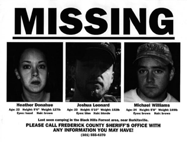
Nine years later, the low budget horror film The Blair Witch Project (1999) released on Sundance Festival. The film’s official website featured fake police reports as well as ‘newsreel-style’ interviews, which indicated that the film was entirely made out of found footage and that the filmmakers had gone missing. One prominent marketing campaign tactic was that missing person posters of the cast were put up at the festival grounds. These images used the classical missing poster characteristics: portraits in a high contrast, bold and black typography, short descriptions and contact information at the bottom (see Figure 4). The posters fooled many viewers into actually believing that the characters bore the same name as their respective actors. This resulted in family members receiving condolences and people on the internet investigating the case. The marketing stunt turned out to be very successful. According to USA Today, The Blair Witch Project (1999) was the first film to go viral, despite having been produced before many of the digital technologies that facilitate such phenomena even existed. The fact that the poster used realistic missing poster characteristics embedded in the consciousness of the public, probably bolstered the campaigns success.
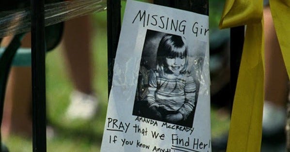
Another interesting example of a fictional missing persons poster is seen in Ben Affleck’s Gone Baby Gone (2007). In this poster, it is just a black-and-white image of the missing girl Amanda McCready, that is printed in the centre space of a a4 while the rest of the paper appears to be handwritten with a black marker. (see Figure 5). This first detail mentioned is notable, mainly because the film is set in a time where colour print was already the norm. The style choice have something to do with the fact that the film revolves around a poor mother living in a low-income neighbourhood in Boston, perhaps lacking the financial means to distribute colorized pictures. But, it could also be that the filmmakers considered the notion that the typical black-and-white, high contrast evokes more clearer associations with (true) crime. The handwritten text adds a personal touch to image; emphasizing the desperateness in this public cry for help. Gone Baby Gone (2007) was shelved in the United Kingdom because of similarities to the disappearance of Madeleine McCann.
Over the course of the 21st century, computers and household printers became more affordable, enabling relatives and friends of missing persons to produce their own material from home. Before that time, missing posters were often created by local law enforcement, using a format in which aesthetics are measured against functionality. The introduction of more affordable colour printers in the global market also meant that many missing posters were suddenly printed in colour; changing the grim aesthetic of the grainy black-and-white flyer that was commonly used for decades.
Although the real fear of ‘stranger danger’ has died down since the late 1990s, the popularity of children facing evil in horror films has recently increased. ‘Endangered children are one of society’s prime fears, and many a modern horror centres on either scared kids or scary kids — ideally both,’ wrote Steve Rose in an article for the Guardian on the psychological effects on children working in Hollywood. When the first set footage from of the anticipated IT-remake got out, many fans pointed out the missing person posters. ‘The posters are truly scary in that they remind us how omnipresent evil is, but they are also fascinating in a morbid, not-to-be-spoken-of sort of way,’ wrote journalist Dustin Kemp for the Inquisitr. ‘Those everyday horrors that lurk under the surface of “normal” life were and are one of Stephen King’s favourite themes to invoke in his writing, and It […] was laced with allusions to such themes.’
Only a year after the release of IT (2016), the third season of David Lynch’s hit series Twin Peaks (1990–2017) was promoted with guerilla marketing techniques in Australia (see figure 6). ‘Posters portraying the murdered prom queen from the series are being spotted plastered on walls from Sydney to Melbourne to Perth, prompting viewers to call a mysterious telephone hotline for information,’ Emma Mack stated in Mandatory.

Guerrilla marketing stunts like these prove that the aesthetics of older missing person posters have become a part of our collective consciousness. Almost everyone immediately recognizes these images and associates them with true crime and thriller films, even if the aesthetics of actualised missing posters have changed drastically and now often use colour. What is interesting is that in fictional media, it is mostly kids or young adults that are the subject of the missing poster. Movies, even more so than society, deem the young as vulnerable and viable symbols for their stories. Perhaps their innocence is easily framed inside the eerie format of the missing poster; the sole image format in which you never want to see a child portrayed.
Amber Alert
The ‘Milk Carton Kids’ campaign mentioned earlier became practically obsolete in the 1990s with the introduction of the AMBER Alert System, a more modern child abduction alert system distributed by media channels and via SMS, that is still used in the United States today. The AMBER Alert System was initiated in the US after the murder of Amber Hagerman in 1995. Her death sparked outcries for tougher laws on child molesters and initiated the development of the AMBER Alert programme, which used SMS, internet and radio to quickly alert the public when a child went missing.
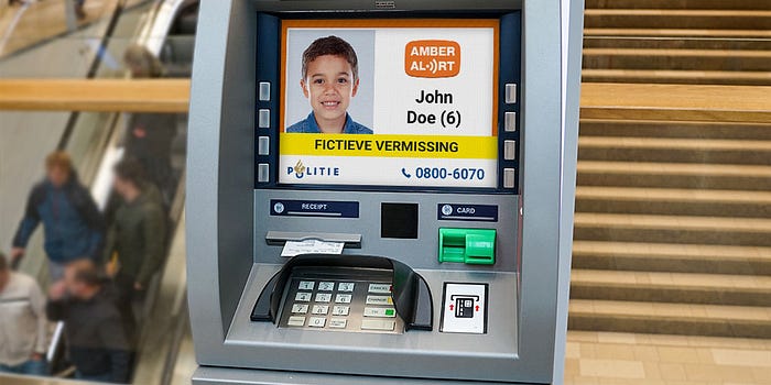
Inspired by the success of the Dutch AMBER Alert, the AMBER Alert Europe foundation was launched in 2013. In many European countries, public digital signs are used to display the image of the missing child. In big cities, the image and contact info is can be instantly displayed on ATMs, digital billboards, road signs and other digital displays in the public space.
The increased use of the internet over the course of the 21st century largely shifted the spread of the missing person to being distributed online. The FBI, intelligence services and local governments have established online databases in which missing person cases are archived and categorized, easily accessible to investigators as well as the public. Technological advances have led to large improvements in (digital) facial constructions. Sometimes digital technologies are used to create a so called age progression of the missing person, as to match their respective appearance in the current day (See figure 8). There is something incredibly eerie about these age progressions. Aside from their ‘uncanny valley’ attributes, they function as a reminder of what the missing person would’ve looked like if they hadn’t disappeared. The brutal truth, of course, is that most of these people are long dead. Despite being a admirable attempt of assistment in the search for these victims, the dark irony is that these age progression images — the visual representation of a final glimmer of hope — mainly seem to remind the public of a life that could’ve been.
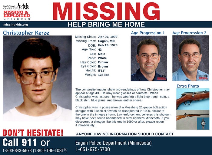
The rise of social media further increased the online circulation and spread of missing persons flyers. Images on these digital flyers were often distributed in colour and with more elaborate descriptions of the person in question. Its imagery sometimes matches the characteristics for product advertisements, since its colours are vivid and layouts are designed to garner attention. Through online communities, pictures are shared easily and have helped to solve numerous missing person cases.
Although still using some similar characteristics, these contemporary posters lack the rough aesthetics that used to be so typical for the 20th century missing poster. Still, Through means of reproduction in television and film, the traditional missing poster lingers in the our collective memory as an eerie image of silent violence. No matter its shape or form; the missing person poster will always remain an ominous presence inurban society… the smiling person on the paper reminding us of the horrors that lurk beneath the surface of our everyday lives.
